
Over the years we are noticing a lot of logo makeovers. Most logos are becoming more simplified (Vector looking) with less gradient shading.
Arby’s used to be 3D and gradient:
Spotifys logo looks clean and simple now. Imagine how the old logo would look if it was faxed- very shady and muddy in grayscale.
Gap looks friendlier than before. I would have liked the text to e navy though.
Cartoon network logo looks more stable and powerful, the opposite of the playful appearance it had before.
Comedy central’s new logo has nothing to do with the previous. It’s interesting how similar it looks to the Copyright symbol. The rotation of ‘Central’ adds playfulness to the appearance.
Ebay’s logo used to look abstract and whimsical, now it’s simple and still retaining pure crayon colors.
Internet explorer has created more suttle gradient shading.
TGI Fridays looks more stable and simple. The border is a reminder of traffic signs which grabs your attention.![]()
JC Penny looks much better by creating a frame and a focal point within the frame and the colors are patriotic.![]()
Wow! A fish? … Can you believe how much history this company has?!![]()
Shell has transformed from a realistic ink looking image to an abstract vector based look.![]()
Microsoft has grown to simplicity.![]()
Sometimes being indirect is the best approach, what My Space has done is brilliant: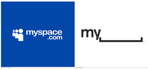
Olay removed color, changed font style, line change and woman’s image:
Paypal decided to remove outlines and have a two toned blue. Pepsi has had an amazing revaluation from super whimsical to a stamp like look. Again pay attention to the patriotic color use.
![]()
Seattle’s Best is unrecognizable. Very futuristic, clean and strong. Great use of negative space. 
United Airlines has recognizable reputation, therefore it can remove the Airlines portion of the logo and still remain obvious.

Yahoo! disappointed me. After all those submissions my expectations rose…
